Process
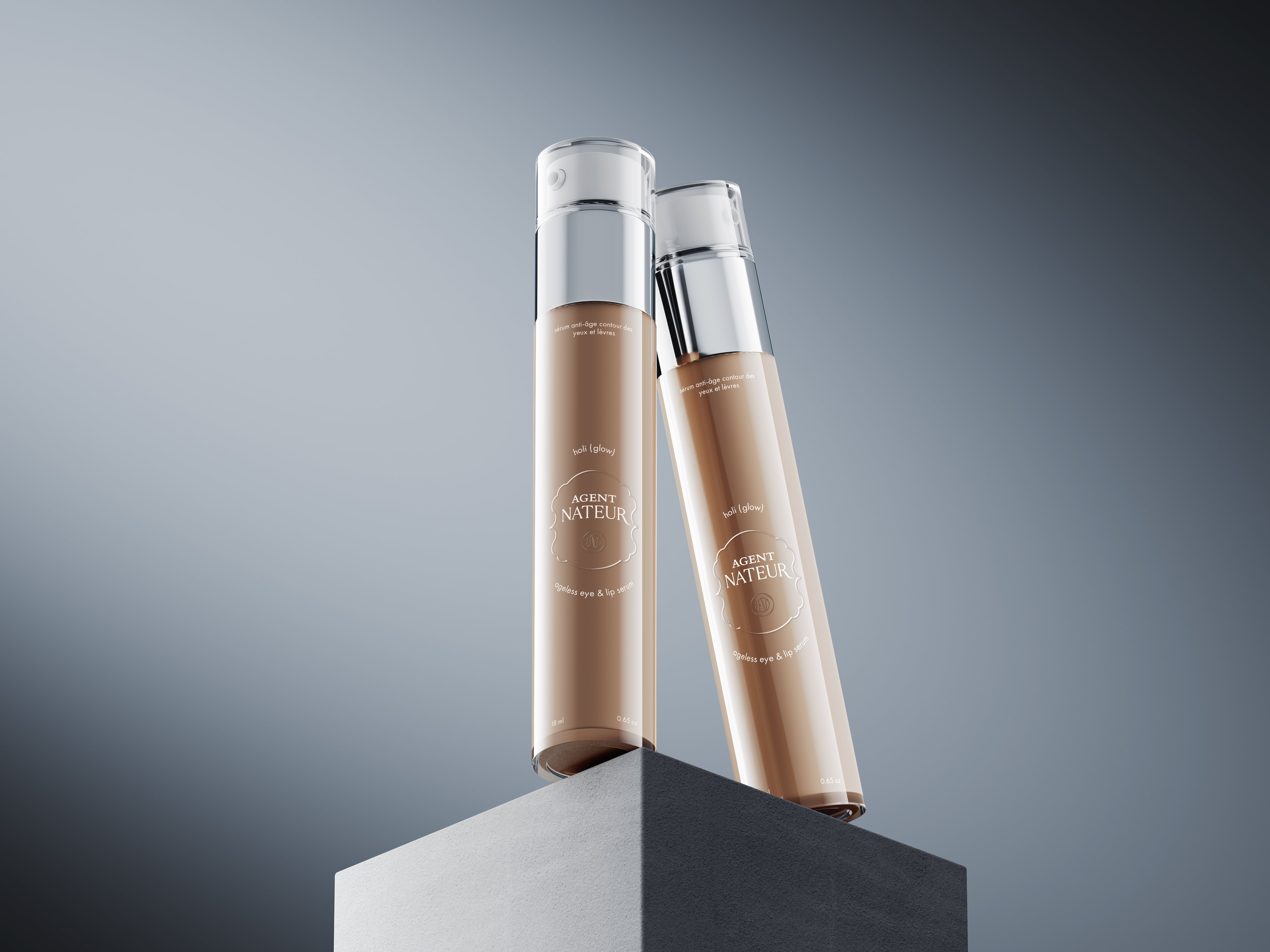
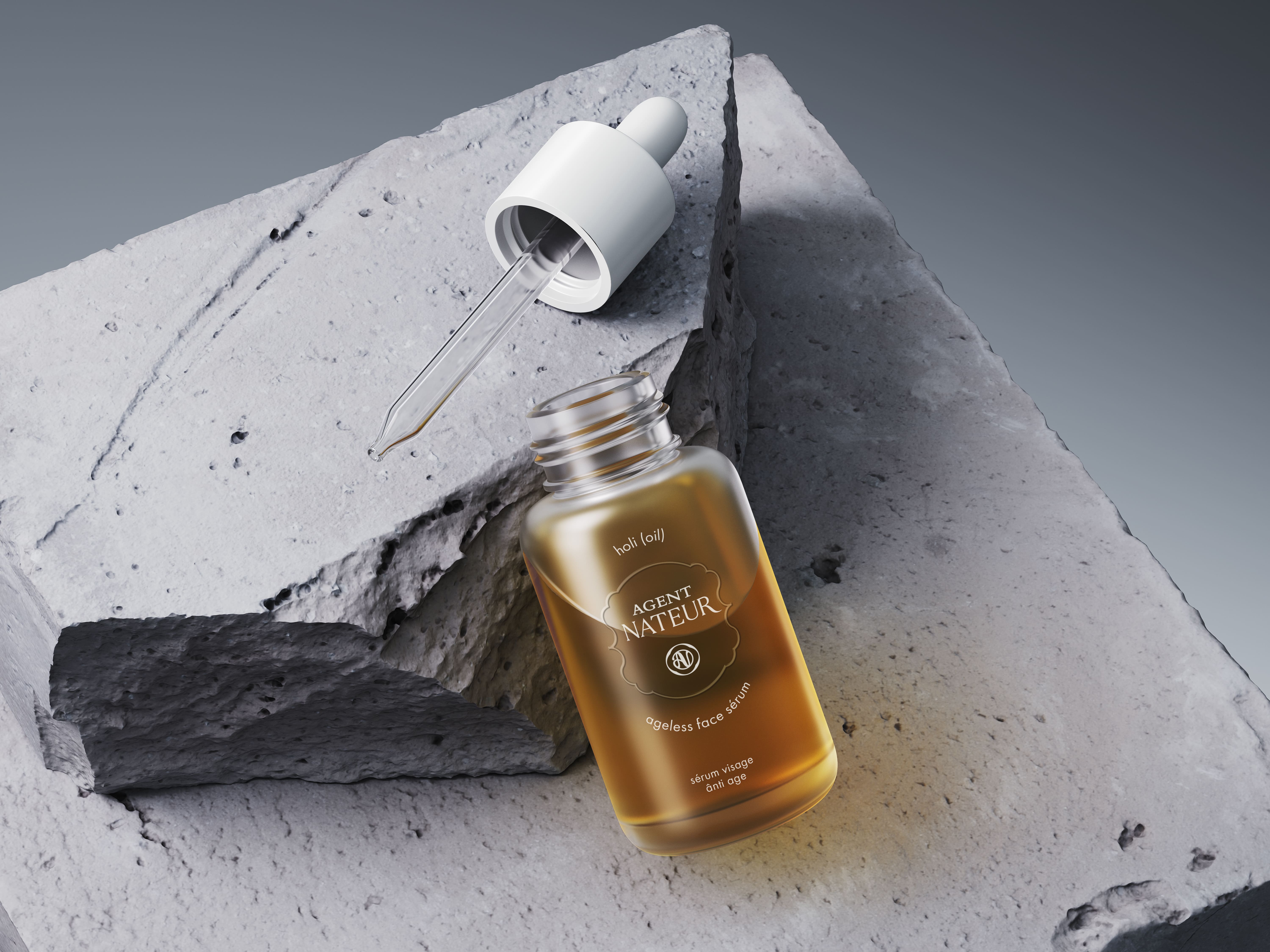
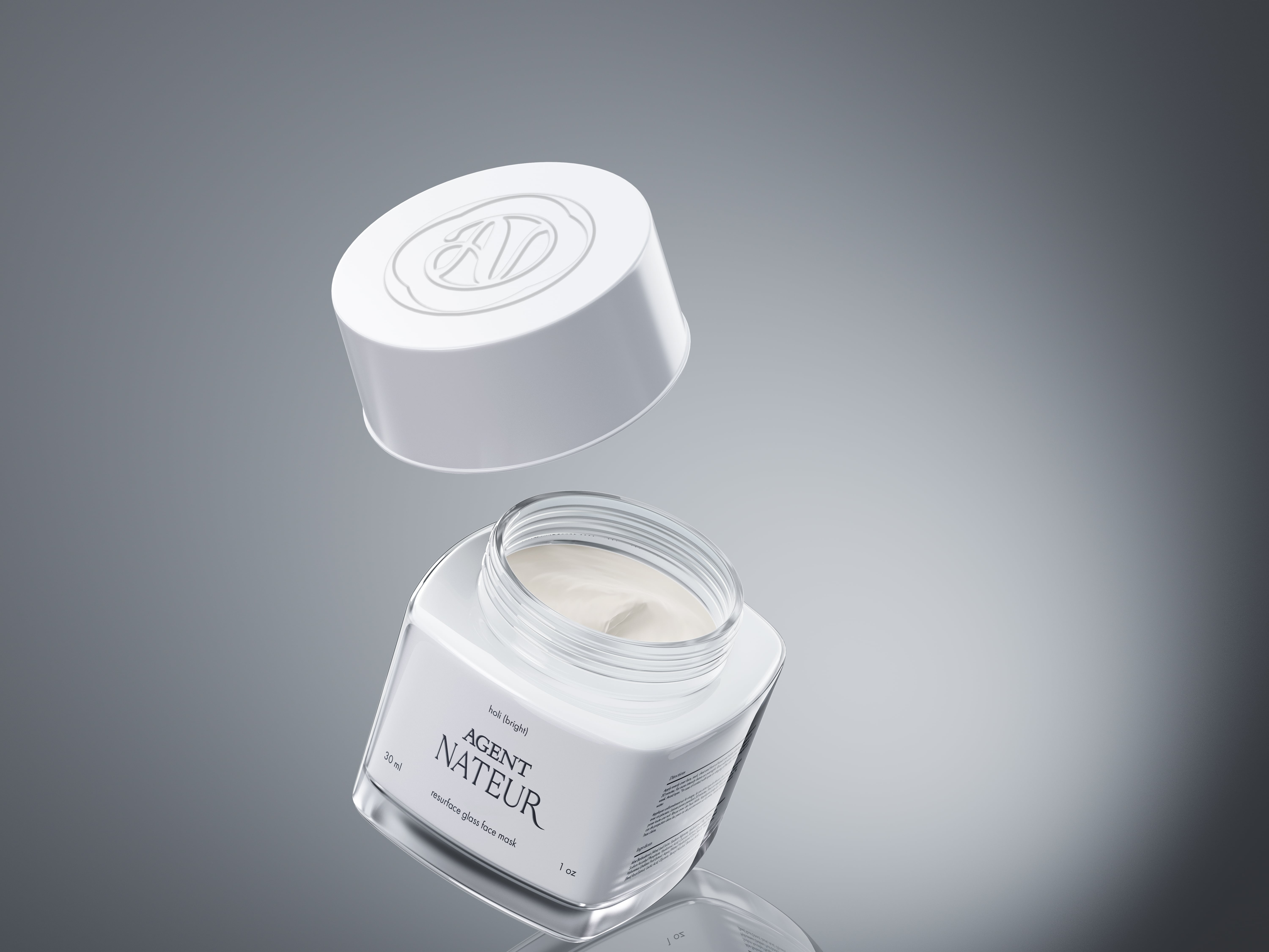
Agent Nateur stands as an independent, results-driven natural beauty company committed to redefining beauty through performance. A luxurious amalgamation of science and nature, it prioritizes ingredient purity without dilution through filler ingredients. Anti-aging elements are plant-derived, ensuring uncompromised efficacy.
Upon commencing this project, it became evident that the existing logo lacks balance, posing challenges in its application across diverse product lines. Currently, the outdated branding suffers from a lack of brand personality and feels disconnected from the ethos of a natural skincare and beauty brand.
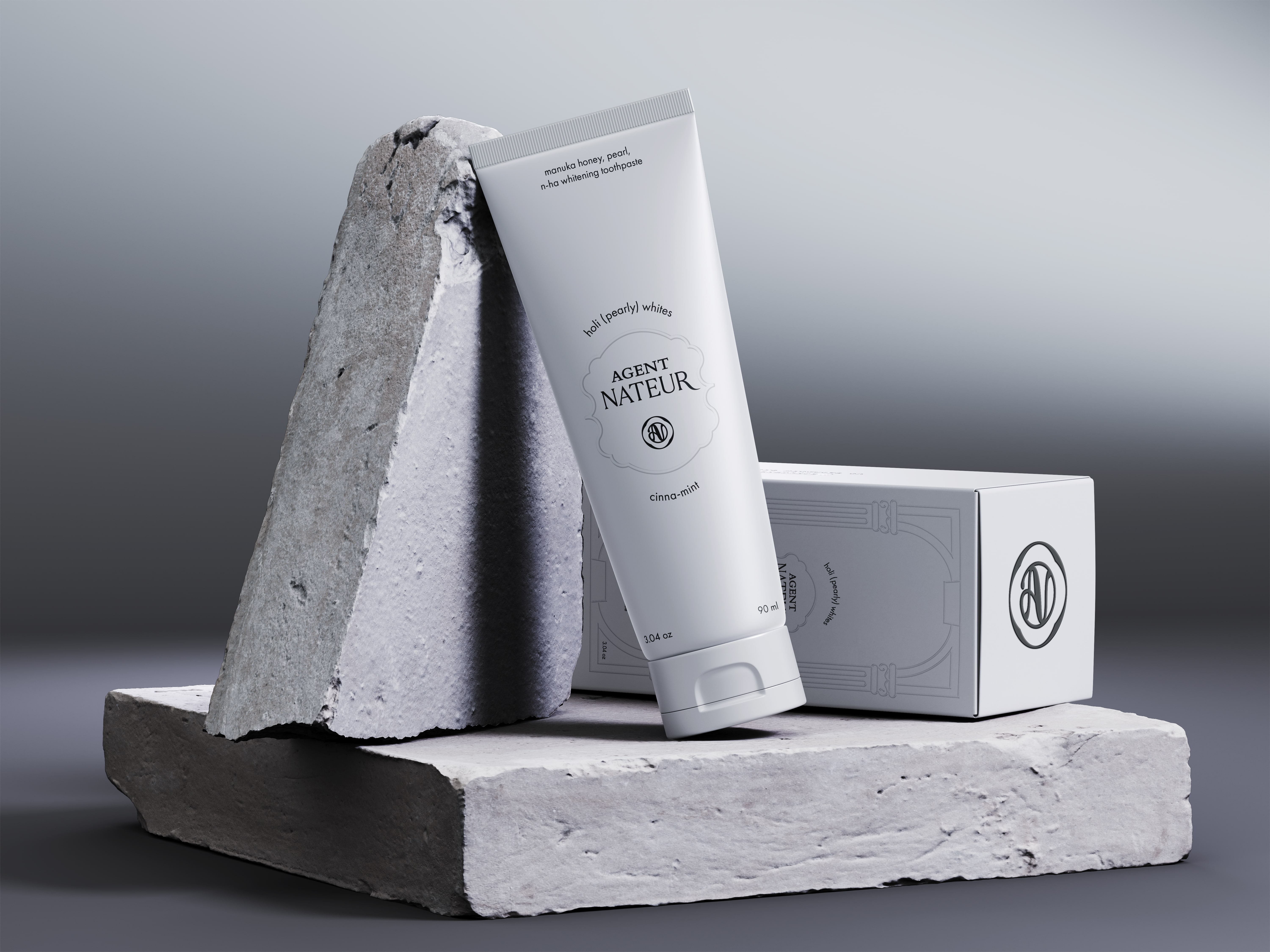
Following the research stage and extensive communication with the client, an intriguing concept emerged: drawing inspiration from the beauty and elegance of Roman female sculpture while embracing the realism of human skin. Imperfections, such as pores or irregularities, are inherent in skin, much like those depicted in Roman sculptures.
This concept embodies authenticity, encouraging individuals to embrace their uniqueness and exude confidence. The proposed approach integrates a refined logotype and a new logomark to form the brand's primary logo crest. This fusion aims to symbolize the essence of human skincare, the timeless allure of Roman sculpture, and the elemental purity of water, which is intrinsic to beauty and skincare rituals.
Services
Brand identity
Strategy
Digital design
